It seems many agencies pay lip service to the need for ‘minimalist’ Powerpoint presentations.
But when it comes down to presenting their agency capabilities/credentials they seem to suffer a bad case of amnesia.
All thoughts of minimal fly out of the window.
If you’re reading a site about account management training, it’s unlikely you’ve escaped the sinking feeling of being on the receiving end of someone else’s bad company intro in Powerpoint form.
It can be hideous and the feeling of foreboding hits you even before it really starts.
That moment when you know it’s coming. You watch as they flip open their laptop and start searching for the right file.
You often get a glimpse of their desk top too; ‘shouldn’t really have that many folders on your desktop should you?’ you think to yourself.
‘Wish I was there right now’ you think as you get a peek of a deserted, paradise beach backdrop photo.
‘Their last holiday in the Maldives maybe?’ you think.
It’s about then that your mind seems compelled to wander off to, well, just about anything other than what you’re about to listen to.
The pile of work you still need to get through before you go home, that email you desperately need to respond to or those tasty looking chocolate muffins that someone’s kindly left in the kitchen – leftovers from their client meeting.
Anything rather than sit through some uninspiring slides and an uninspiring presenter.
You know that you’re going to have to force yourself to start concentrating.
And you’re probably going to have to read lots of words on a screen while simultaneously trying to follow what the presenter is telling you.
Too much effort required.
Control Alt Delete.
This isn’t helped by the fact they go off script so you don’t know whether you should be reading the bullet points or focussing on what they’re saying. confused.com.
I say reading ‘the bullet points’ because when that first slide pops up with those pesky bullet points, your feeling of misery jumps up a notch.
You fight the urge to look at your watch.
‘What am I going to cook for dinner’? your mind won’t stop.
‘Mustn’t forget to buy milk on the way home’ it’s uncontrollable now.
Like a wild caged animal seeking an escape, your mind seems determined to distract you.
I think you’ll know this but a bad presentation has no structure, too many words, too many slides, too many typos and is untargeted, meaning it’s been re-hashed from another presentation and so doesn’t really suit the audience.
In fact there is an argument for banning Powerpoint use in meetings. I think there’s a Facebook fan page somewhere. It’s become a movement.
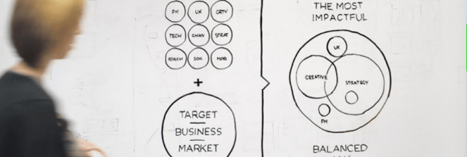
So the next time you need to use Powerpoint to make a presentation, surprise everyone. Grab a pen go to the whiteboard/flip chart and just talk, tell a story.
Engage them.
Keep it short.
Keep it succinct.
Keep it conversational.
Use something visually interesting to illustrate your points – anything but bullet points! e.g. hold up an object and tell a story (rather than show them a bullet pointed list of all the awards you’ve won for your work, hold up one of the award trophies and talk about why you won it and how it helped the client’s business).
Ask if you’re on track? Get some feedback?
Pause.
Look at them. Are their eyes glazing over? Twitching fingers next to their mobile phone? Got their laptops open writing emails? (god I hope not, you might as well jump out of the window).
Just don’t bore people.
For the full list of ‘don’ts’, watch this 4 minute video clip. While the audience is laughing a little bit too hard for my liking, it kind of sums up what you need to know.
Enjoy. And please leave a comment in the box if you have any funny stories from your experience either giving a Powerpoint presentation or being subjected to one.

